A Scandinavian–Japanese Dining Ritual
Still. Raw. Felt.

In a hospitality landscape crowded with theatrics, themed excess, and high-gloss design, KOA was created as a retreat. A cultural anchor for a new luxury ski resort in Eastern Europe. A place for the overstimulated, the culturally attuned, and the emotionally curious. The brief called for something modern yet timeless, bold without spectacle. We responded with restraint: a brand that whispers, holds presence, and dares to slow the guest down.
The concept draws on Japandi principles—clean lines, raw wood, soft light—but moves beyond aesthetic. Every detail becomes a gesture. A warm towel in place of a greeting. An amuse-bouche served in silence. The scent of cedar and frost in the air. The menu moves like a meditation—from quiet warmth to bold heat to contemplative stillness. No Alpine clichés. No storytelling gimmicks. Just sensory clarity and emotional resonance.
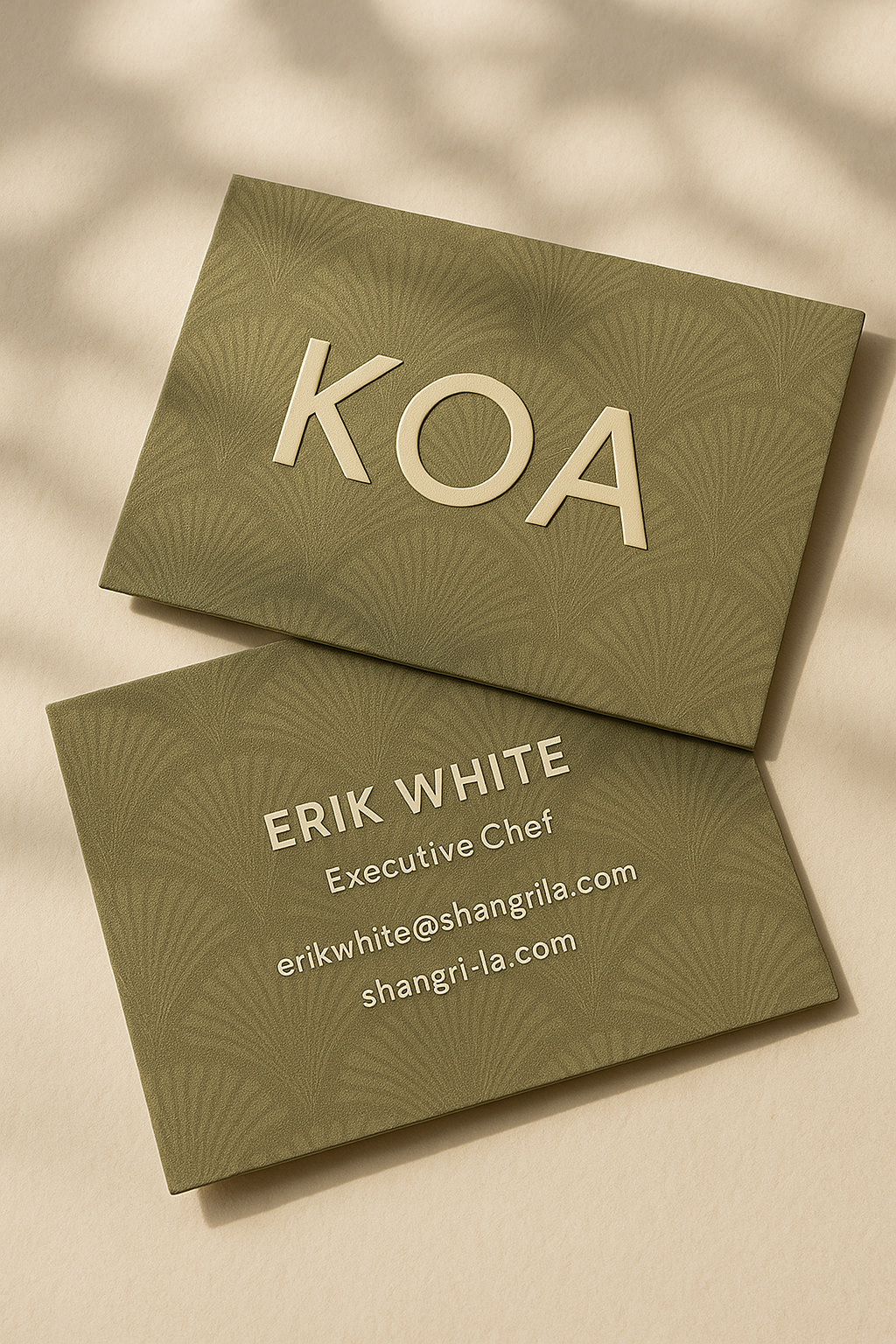
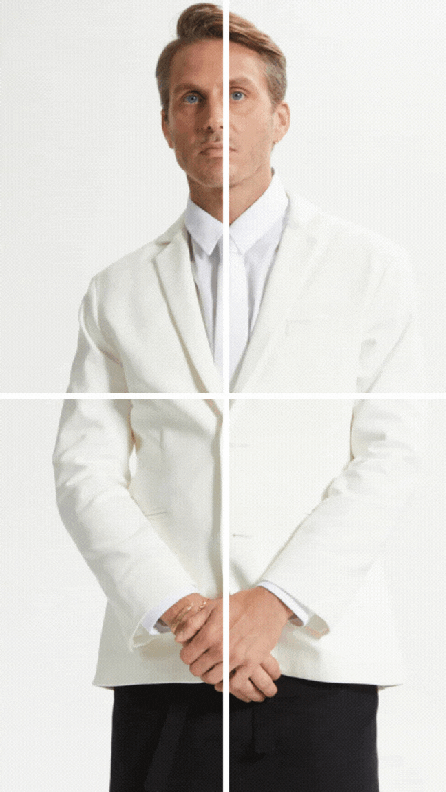
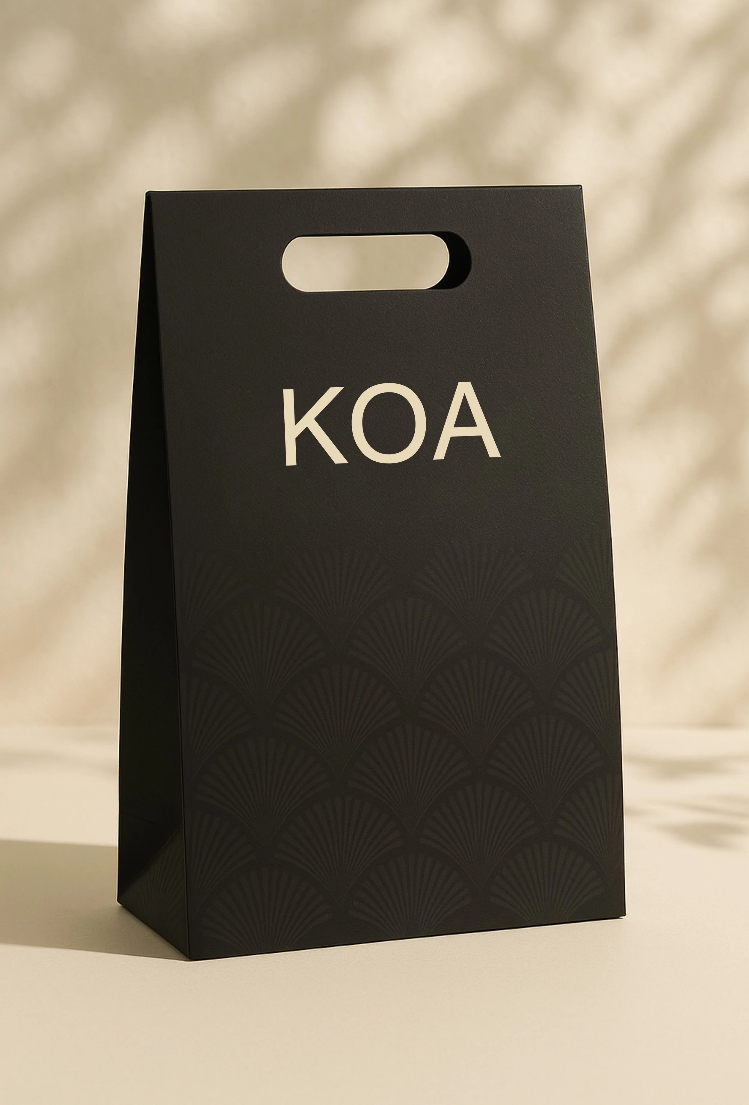
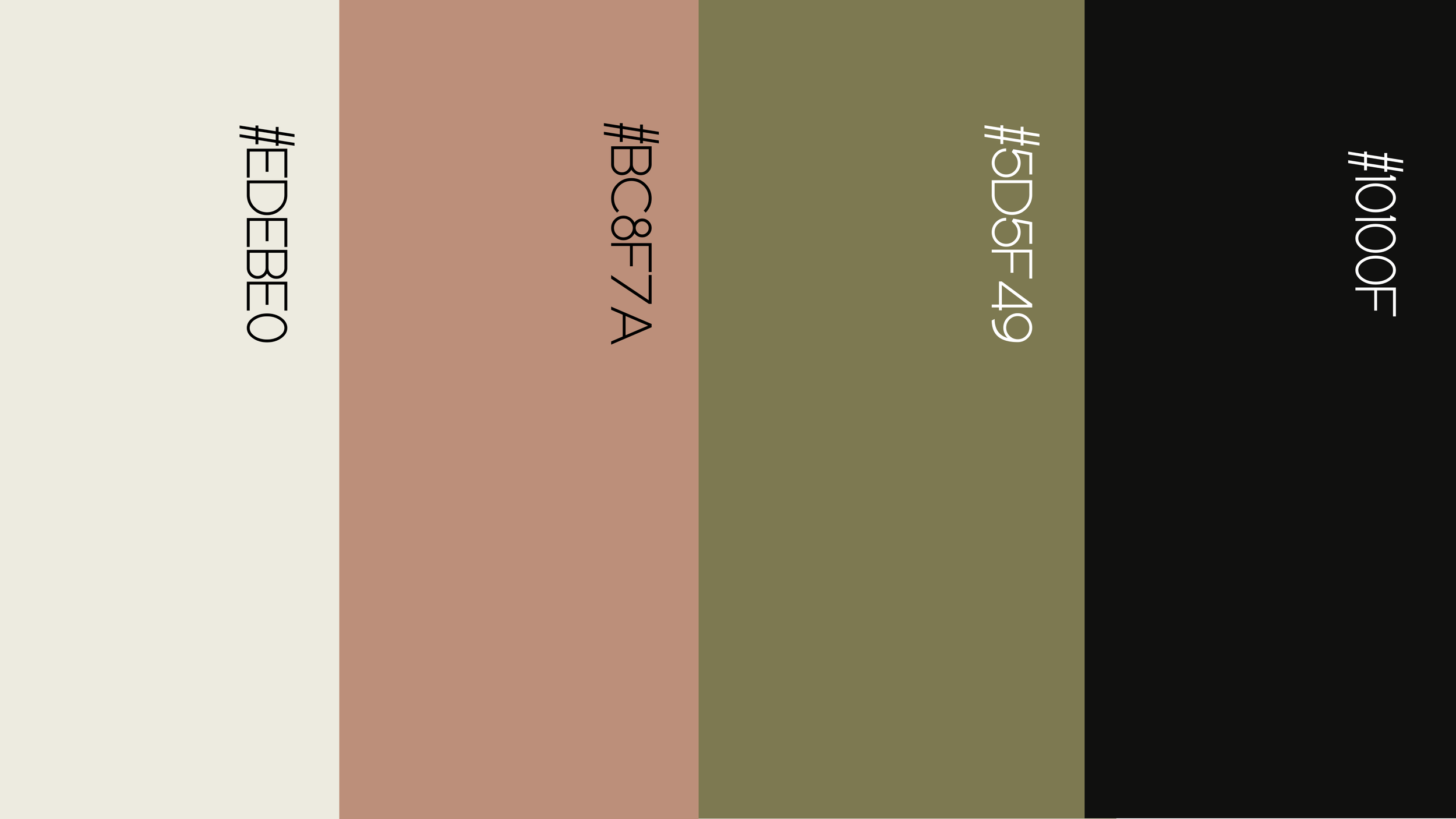
KOA’s identity reflects this philosophy: a quiet logotype, a fan-like motif inspired by ginkgo leaves and Eastern European embroidery, and a palette of alpine clay, charred wood, and olive green. Even the uniforms and take-home bags carry the same tactility and tone. Beneath each plate, a hidden line of poetry invites the guest to pause. In a world of curated noise, KOA doesn’t demand attention. It lingers—quiet, felt, and unforgettable.